The homepage of an app often serves as the user's initial touchpoint—it's a landing zone that provides an overview of features, highlights what's new, and allows quick navigation to various sections. A well-designed homepage not only enriches the user experience but also streamlines the onboarding process for new users.
The Dojo for Business App did not previously feature a dedicated homepage, a shortcoming that was addressed with the initiation of our Homepage Experiment.
The opportunity
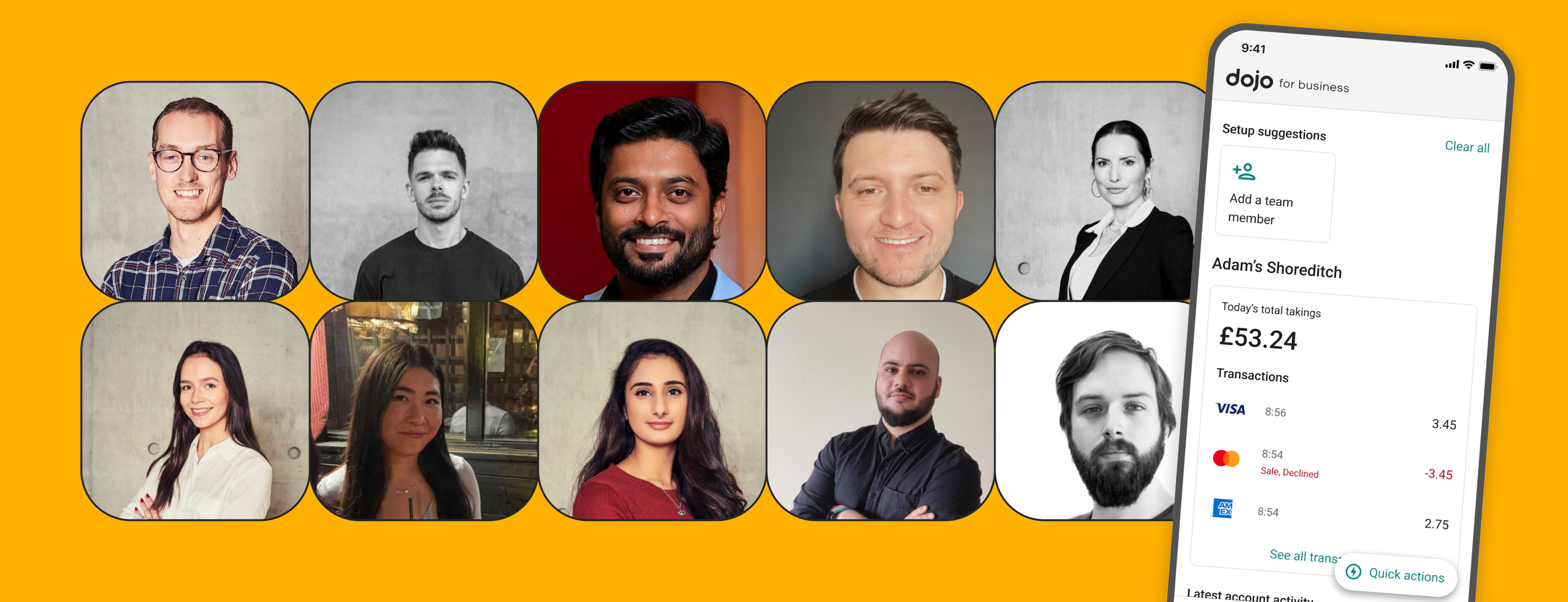
With over 50,000 monthly active users, the Dojo for Business App has a robust customer base. For existing users, logging in leads to a transaction list, which, while relevant, left room for improvement. The experience was lacking further for new users, who were greeted by an empty screen. We saw this as a missed opportunity.

Our objectives
Understanding the gaps, we set out to design and build a homepage that would:
- Extend a warm welcome to users.
- Present information relevant to customer’s needs.
- Showcase Dojo’s diverse range of tools and services.
Our immediate goal was to validate whether a homepage would add tangible value for our users.
A data driven approach
To address this, we started modestly with a Minimum Viable Product (MVP) of the homepage, guided by data-driven insights. We segmented the homepage into:
- Hero Sections: Widely used features like Transactions, Transfers, Billing, and Payments.
- Side-Kick Sections: Less frequent but still valuable features such as Card Machines, Locations, and Team Members.
We used data to guide our decisions so that we could ensure that what we put in front of users was not just a shot in the dark but based on concrete insights.


Execution strategy: MVP and iterative delivery
We adopted a mindset that focused on core values and efficiency:
- ‘For Us, For Them’ Mindset: We sought to create value for both the company and the users.
- Complexity Evaluation: We aimed for the lightest touch possible to keep things simple.
- Rapid Value Delivery: Our goal was to deliver something meaningful every two weeks.
- Flexibility: We were ready to pivot our strategy based on outcomes.
- Intentional Iteration: We committed to continuously improving the user experience.
Customisation led by user needs
We recognized that our user base could be divided into two primary categories: Single Location Users (90%) and Multi-Location Users (a smaller but high-value group). This helped us tailor features for different use cases.
The first version, designed for Single Location Customers, was rolled out in one sprint. The second, catering to the needs and the complexities of the Multi-Location Customer, was deployed over two sprints.

What were we testing?
Our primary goal was to gauge the effectiveness of a homepage in increasing app engagement and conversion rates of key features.
Our hypothesis was clear: If we create a homepage for the Dojo for Business app, we will see an increase in app engagement and higher conversion rates for relevant features because the homepage will improve awareness of the app's features.
Metrics and outcomes
As a proxy for engagement, our primary metric was:
- Number of sessions in the app.
For wider context and learnings, we looked at several other metrics:
- Number of days on the app.
- Total and average session duration.
- Conversion rates in relevant areas.
- General app and homepage usage to gain a comprehensive understanding of the impact on user behaviour.
The new homepage significantly boosted user engagement. We witnessed a sizable increase in use of the Web (17%) and mobile apps (7%), where new users had a more efficient user experience, with a significant decrease in the time users had to spend to get information.
The homepage also allowed users to discover and utilise app features more effectively. We noted a 23% increase in generating payment links on mobile apps and an 80% uptick in team member additions via the web.
Conclusion
During the process of continually improving our app, we've learned that targeted, data-driven changes can yield measurable results. The introduction of the homepage to the Dojo for Business App serves as a case study in how a focused update can enhance user engagement and streamline access to key features. Through careful planning and continuous iteration, we've succeeded in creating a more user-centric experience that benefits both our customers and the business as a whole.
Stay tuned for more updates as we continue to fine-tune both the homepage and other areas of the Dojo for Business App.